Executive Summary
Flip charts, sometimes referred to as newsprint because of the type of paper used, have been around in training rooms for decades. They are a handy, versatile tool available to trainers, facilitators, and anyone else who needs a visual writing surface for ideas or information. They are great for quickly capturing participant comments, for creating prepared information and graphics, and for displaying material for reference later in a session. One of their greatest assets is the simplicity of use. Anyone can use them to write or draw in a session.
Introduction
Flipcharts are the staple communication method of training. Whether for reporting back from groups, brainstorming, or discussions, noting key points or for filing in for the PowerPoint presentation after a power failure, no training event is complete without them. Flipcharts are inexpensive, yet effective training aids for small groups up to thirty participants (depending on room configuration). They provide an easy way to capture key thoughts or to highlight information in small group settings.
We usually associate flipcharts with classroom or convention presentations, but their central purpose – to record and visually display information that will engage and stimulate audience participation – is also ideal for mediation. Flip charts are “the perfect medium for harnessing the collective brain power of a group” (LUCAS 2000). As visual aids, flipcharts can not be beat. They are simple, inexpensive, low-tech and portable. They require no electrical outlets, batteries, or perplexing software. They can be easily and quickly prepared and produced, without the aid of expensive graphic artists or computer programmers. This alone is a comfort to the technophobes among us.
Tips on Preparing and Using Flipcharts
(Adapted from BRANDT 1986 and JONES 2004)
If you know the strengths and how to use them intelligently, flipcharts offer great advantages compared to its technical successor, the PowerPoint presentation. However, despite being a relatively simple tool, thing can go awkwardly wrong. Like many people you have probably seen flipcharts that make no sense, that you can not read from the back of the room and that look like a spider has crawled over them.
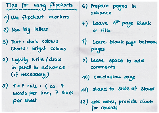
If you follow these ten simple steps and you will have flipcharts that look truly professional:

If you are using flipcharts for a presentation, try to prepare your flipchart pages in advance. This means your audience does not have to wait while you try to draw things on the page.
- Leave one blank page between each prepared page. That way you can add extra detail or jot down audience comments without having to flick through several pages to reach a blank sheet.
- If you need to draw diagrams or charts as you deliver your talk create light pencil outlines on the page in advance. The audience will not be able to see your pre-drawn illustrations - but you will and your finished drawing will look more professional as you can copy the marks.
- Your first page should either be blank or have a 'title page', such as the subject of your presentation. In this way, your first page of text will not distract your audience.
- On each page that you have written some key points leave plenty of space. This means you can add in comments from the audience (in a different colour) as you go through your talk.
- Use big letters (but not capitals) so that your audience can read your writing. Stick to the 7 x 7 rule: Not more than 7 words per line and not more than 7 lines per page.
- Reserve bright colours for charts and diagrams. Text should be in a dark colour, such as black or blue, so it can be easily seen. Use professional flat-tip flipchart markers (see also coloured cards for more details).
- If you write on the flipchart as you go through your talk, stand to one side so people can see what you have written.
- Make sure you have a conclusion page at the end of the flipchart. You can then turn to this at the end of your presentation and summarise what you have said.
- After your presentation has finished go back through your flipchart pages and prepare some notes based on what was added during your presentation. Alternatively, you can also make photos of each page and insert them in a blank PowerPoint presentation for documentation (JONES 2004).
Making "prepared" flipcharts can take a considerable amount of time. Make sure you start preparing your charts early enough so you can review them and make any changes or corrections before hand. It takes practise to learn how to print neatly. If you do not have neat printing, ask someone to prepare them for you. A poorly prepared flipchart can be very distracting.
Flip charts can be used almost anywhere for visualisation for groups up to 30 people. They are especially helpful for presentations in an open venue or a place without power supply where the projection of PowerPoint presentations wouldn’t work. Flipcharts also offer more possibilities to involve the audience by easily adding comments, developing complex issues by drawing drawings/graphs step by step or by highlighting important sections. Most importantly, flipcharts forces trainers to keep things simple, as they cannot just copy-paste too much text and graphs into lengthy PowerPoint presentations.
Basic Training for Trainers
Ten Tips for Using Flipcharts
11 Tips for Using Flip Charts More Effectively
Flip Charts: How to Draw Them and How to Use Them
The Big Book of Flip Charts
Making Your Flip Charts More Effective
http://www.ljlseminars.com/
A short text on 11 tips for using flipcharts more effectively.
http://www.selfgrowth.com/
This homepage contains tips for using flipcharts effectively.
http://www.usingflipcharts.co.uk/
The site gives you ideas and suggestions for how to get the best out of flipcharts.
http://ezinearticles.com/
Some more tips to prepare good flipcharts.
